
Digital marketing dashboard: how to build yours
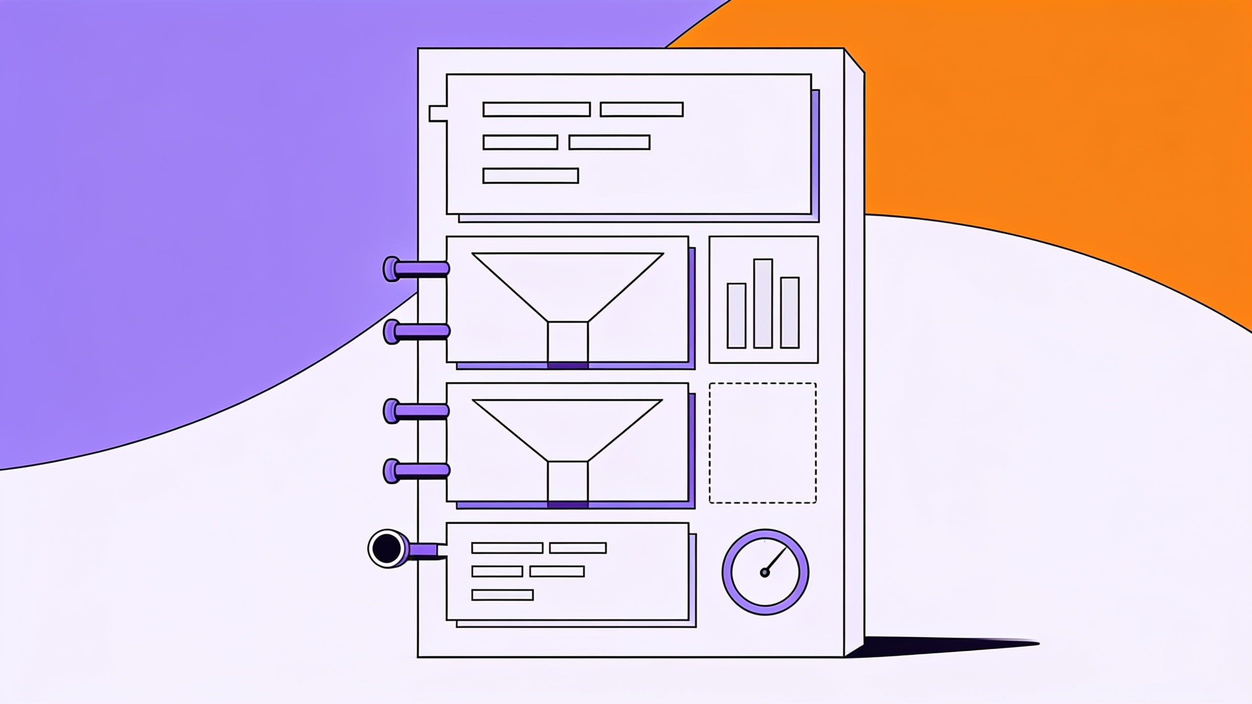
Monday, 9am. The team dashboard opens with 28 cards: impressions, reach, CPM, CPC, clicks, sessions, users, bounce rate, new followers. Everyone looks at it for fifteen seconds, agrees things are "going well" and moves on to the next item. Nobody leaves the meeting having decided anything.
The tool is rarely the problem. The problem is that the dashboard was built inside out: someone opened the Meta Ads connector, dragged every available field onto the canvas and called it a dashboard. Connected data does not turn into management on its own. The size of the gap shows up in the numbers: 62% of companies do not track the conversion rates of their own funnel, according to the RD Station Panoramas 2026, a survey of 2,790 marketing and sales professionals in Brazil.
A dashboard that survives into its third month is built the other way round: start from the decision, work down to the funnel stage, and only then pick the metric and the source.
What is a digital marketing dashboard?
A digital marketing dashboard is a single panel that gathers the metrics of each funnel stage (acquisition, interest, conversion and revenue) from different sources such as Meta Ads, Google Ads, GA4 and your CRM. Its job is to answer, in seconds, where results are stalling and which decision to make this week.
Start from the decision, not from the tool
Before you open Looker Studio, write down the decisions the dashboard has to support. They are usually few and repetitive: raise or cut a channel's budget, swap a creative, change the offer's price, push the sales team on response time.
For each decision, ask one question: which number would change my choice? If the answer is "none", the metric does not belong on the dashboard. That filter removes reach, impressions and likes in one pass. They describe what happened, but they do not change what you will do on Monday. To sort real indicators from noise, it helps to revisit digital marketing KPIs by funnel stage.
In practice, a dashboard that works carries nine to twelve numbers. Beyond that, reading turns into scanning: the eye passes over everything and stops at nothing.
How to build the dashboard by funnel stage
The structure that works is the funnel, because that is how money moves: someone sees, someone gets interested, someone buys, someone comes back. Each stage carries three pieces of information: a volume, a cost and a pass-through rate to the next stage. The pass-through rate is what reveals the bottleneck.
| Stage | Volume | Efficiency | Pass-through rate |
|---|---|---|---|
| Acquisition | Impressions, clicks | CPM, CPC | CTR |
| Interest | Sessions, key pages | Cost per session | Session to lead |
| Conversion | Leads, opportunities | CPL | Lead to sale |
| Revenue | Sales, revenue | CAC, ROAS | Repurchase in 90 days |
Volume without pass-through is misleading. Forty thousand clicks converting at 0.4% return less than eight thousand clicks converting at 3%, and a dashboard that only shows clicks hides exactly that difference.
A worked example, to get out of the abstract
A custom furniture retailer spends $30,000 a month on media. For the closed month: 600,000 impressions, 12,000 clicks, 9,600 website sessions, 480 leads and 48 signed contracts at an average order value of $2,100.
The derived numbers make the diagnosis on their own: 2% CTR, $2.50 CPC, 80% of clicks becoming sessions, 5% of sessions becoming leads, 10% of leads becoming sales, $62.50 CPL, $625 CAC and $100,800 in revenue, which works out to a ROAS of 3.36.
With the dashboard organised by stage, the Monday conversation changes subject. The bottleneck is not media: it is the lead-to-sale handover. Doubling the budget would only produce more leads the sales team already cannot handle. The figures above are a simulation calculated to illustrate the reading, not survey data.
Which data sources to connect, and in what order
The temptation is to connect everything on day one. It works better in three waves.
The first wave is the media platforms (Meta Ads and Google Ads) plus GA4. They answer acquisition and interest and already deliver half the dashboard. The second wave is the CRM or the sales spreadsheet, which closes the loop through to revenue. Without it, the dashboard measures cost and not return, which is the fastest way to lose the leadership team's trust. The third wave is everything else: email, WhatsApp, support, operating costs.
It pays to know each source's limits before promising anyone a number. In GA4, for instance, event data retention on standard properties is 2 or 14 months depending on the setting: comparing against the same month three years ago simply is not possible there. The Looker Studio documentation also warns that Google Analytics applies sampling to large datasets, which explains small differences between the dashboard and the GA4 interface. Better to find that out now than in front of a client.
The key almost nobody standardises
Different sources only talk to each other when they share a key: same date, same channel name, same campaign name, same currency, same lead definition. This is where most dashboards break, and the usual culprit is campaign naming and UTM parameters improvised on the fly. "promo_september", "Promo Sep" and "PROMO-SEP" are three distinct campaigns to any tool.
Standardising upfront costs an afternoon. Fixing it later costs rework every month, forever.
The mistakes that get a first dashboard abandoned
- A metric with no comparison. "1,200 leads" says nothing. "1,200 leads, 9% above last month, target of 1,400" says everything. Every number needs a prior period or a target beside it.
- Everything at the same weight. If all 28 cards are the same size, the reader has no idea where to look first. One large headline number at the top, everything else smaller.
- The wrong granularity. A daily dashboard in a business with a 60-day sales cycle creates panic for no reason. The reading window has to be wider than the cycle.
- No owner. A dashboard with no owner stops being updated, and three weeks later nobody trusts it any more.
- A dashboard answering nobody's question. A dashboard nobody reads does not have a design problem, it has a question problem.
Dashboard, report, or just asking the data?
It is worth separating the three, because plenty of people ask for one and need another. The dashboard is for monitoring: the same numbers, kept fresh, read at a glance. The report is for explaining: text, context and a recommendation, produced at a specific moment. The one-off question ("why did CPL jump on Tuesday?") fits neither, and it is the most frequent request of all. That boundary is unpacked in dashboard versus report: the difference, and the sales-side version of the same reasoning appears in sales dashboard examples.
A well-built dashboard reduces one-off questions; it never eliminates them. Anyone expecting zero ends up frustrated and abandons the dashboard in month two.
Frequently asked questions
Which metrics belong on a digital marketing dashboard?
One headline business number (revenue or closed sales) plus two or three metrics per funnel stage: volume, cost and pass-through rate. In practice, nine to twelve numbers. Reach, impressions and likes stay off unless they genuinely support a decision.
Can you build a digital marketing dashboard in Excel?
You can, and for anyone starting out it is the best option: a spreadsheet forces you to define the metrics before fighting with a connector. The limit shows up when updating becomes a weekly manual chore, or when the row count makes the file slow. Spreadsheet limits tend to arrive sooner than expected.
How often should the dashboard be updated?
Updates can be daily and automatic, but the reading should follow the business cycle: weekly for ecommerce and performance media, monthly for long sales cycles. Reading daily data on a long cycle only produces rushed decisions.
How long does it take to build a first dashboard?
With metrics defined and sources accessible, one to two weeks for a first useful version. The slow part is almost never building the screen: it is standardising campaign names and agreeing on the lead definition between marketing and sales.
A dashboard decides nothing; the person reading it does. The funnel-stage structure exists only to shorten the distance between a number and a decision, so that the Monday meeting opens with "the bottleneck is here" instead of "things are going well". If building and maintaining that panel is eating your team's week, Sherlok connects Meta Ads, Google Ads, GA4, CRMs and spreadsheets and lets you ask your data questions in plain language and get the analysis back ready — with no dashboard to build.
Want to see this in your own data?
Connect your accounts and ask your first question in 5 minutes.
- No card to start
- Nothing changes in your accounts without your approval